Get started
Create a Calaméo skin
Creating a custom Calaméo skin is easy. Follow the steps below to create your very own viewer design.
Create a new CSML canvas
First, create a new CSML document on your computer using your favorite text editor. Every CSML file starts with the following header:
<?xml version="1.0"?>
The first element of your custom skin must be a root tag:
<?xml version="1.0"?>
<root xmlns="http://skin.calameo.com/2.0">
    ...
</root>
Please note the value of the xmlns attribute: https://skin.calameo.com/2.0.
Loading a library
Before using picture and any other elements, you will need to tell Calaméo where to find them. Skin elements can be loaded from media like PNG, JPEG and GIF files.
For example, to import a media-based canvas:
<media name="mediaLib" source="https://www.example.com/library.png" />
Place the document container
The viewer statement defines how much space is allocated to the actual publication inside the screen.
This line displays the viewer, with its margins from the sides of the screen:
<viewer left="50" right="50" top="70" bottom="100" />This element is required.
Create some buttons
Add a layout container
First, we need to create a layout container. A CSML file can have as many layout containers as necessary.
<layout horizontalCenter="0" top="10" alignment="center">
    ....
</layout>
The layout element contains one or more content elements.
See layout for more information.
Add navigation buttons
We are now ready to add some buttons to our layout container. Let's add some navigation buttons! Insert this inside your layout statement.
<layout horizontalCenter="0" top="10" alignment="center">

    <button action="previousPage" upState="swfLib#btnPreviousPage" />
    <button action="nextPage" upState="swfLib#btnNextPage" />

</layout>
These buttons are very simple. They have an action and a default state upState.
The upState attribute references an element within the "swfLib" library, by its unique ID.
Creating a bitmap based button
In some cases, it is much easier to create a bitmap picture (either JPEG, PNG or GIF) containing all the graphic elements for your skin.
Once you've loaded it using the media statement, you can crop a region and use it for button states, for example.
Let's use the previously loaded bitmap canvas named "mediaLib" for our zoom button.
<layout horizontalCenter="0" top="10" alignment="center">

    <button action="previousPage" upState="swfLib#btnPreviousPage" />
    <button action="nextPage" upState="swfLib#btnNextPage" />
    <button action="fullscreen" upState="mediaLib#85,32,35,35" />

</layout>
To define a region to crop, you need to specify a set of coordinates, in this order: x, y, width, height (separated by commas).
Add a submenu
Calaméo Skin Markup Language (CSML) allows you to create submenu buttons using a very simple syntax.
<layout horizontalCenter="0" top="10" alignment="center">

    <button action="previousPage" upState="swfLib#btnPreviousPage" />
    <button action="nextPage" upState="swfLib#btnNextPage" />
    <button action="fullscreen" upState="mediaLib#85,32,35,35" />
    <button action="submenu" upState="swfLib#btnSubMenu">

        <button action="book" upState="swfLib#btnBookOn" />
        <button action="slide" upState="swfLib#btnSlideOn" />

    </button>

</layout>
This last block displays a vertical submenu.
The complete Skin
Congratulations! You've just created your first Calaméo Skin.
<?xml version="1.0"?>
<root xmlns="http://skin.calameo.com/2.0">

  <media name="mediaLib" source="https://www.example.com/library.png" />

  <viewer left="10" right="10" top="60" bottom="10" />

  <layout horizontalCenter="0" top="10" alignment="center">

            <button action="previousPage" upState="swfLib#btnPreviousPage" />
            <button action="nextPage" upState="swfLib#btnNextPage" />
            <button action="fullscreen" upState="mediaLib#85,32,35,35" />
            <button action="submenu" upState="swfLib#btnSubMenu">

                <button action="book" upState="swfLib#btnBookOn" />
                <button action="slide" upState="swfLib#btnSlideOn" />

            </button>

        </layout>

</root>
Try and adapt it to your own use, tweak it to see the effect, and if you want to make more changes, continue reading for all the available attributes and elements.
Allow Calaméo to access your resources
For security reasons, Calaméo cannot access files on other websites. In order to load your CSML file and your skin elements, you have to grant Calaméo access to it.
The Access-Control-Allow-Origin header
You need to enable CORS (Cross-Origin Resource Sharing) for your custom skin XML and graphic resources files.
For more information on how to enable CORS, simply follow the steps detailed here: https://enable-cors.org/
The crossdomain.xml file
To authorize Calaméo to load elements on your website, you must place a crossdomain.xml file containing the following text at the root of your domain:
<!DOCTYPE cross-domain-policy SYSTEM "https://www.macromedia.com/xml/dtds/cross-domain-policy.dtd">
<cross-domain-policy>
    <site-control permitted-cross-domain-policies="all"/>
    <allow-access-from domain="*.calameo.com" />
</cross-domain-policy>
Ex. : If your website is https://www.example.com, place the crossdomain file here https://www.example.com/crossdomain.xml
You can also download the crossdomain.xml file to be placed on your server by clicking here (right click, save as "crossdomain.xml").
Customize the embed code
The HTML embed code can be customized by adding parameters to the URL in the SRC attribute of the IFRAME tag.
Global parameters
| Attribute | Type | Default | Description |
|---|---|---|---|
| mode | Display mode of the publication. Can be either viewer (full-sized publication), mini (interactive thumbnail) or empty. If empty, the publication will choose the appropriate mode according to its current size | ||
| view | Force the startup view of the publication. This parameter overwrite the view selected in the publication properties. Can be either book (pageflip), slide (slideshow), scroll (vertical scrolling) or empty. If empty, the view selected in the publication properties will be used | ||
| page | 1 | Open the publication at the specified page on startup | |
| volume | 75 | Set the default publication volume for audio and video playback. From 0 to 100 | |
| language | Set the publication localization. Can be either en (English), fr (French), es (Spanish), it (Italian), de (German), pt (Portuguese), ru (Russian). If empty, the publication will try to determine the most appropriate localization to use according to the user browser language | ||
| skinurl | Specifies the URL of a custom skin XML file. This feature is only available to PREMIUM and PLATINUM accounts | ||
| styleurl | Specifies the URL of a custom stylesheet. This feature is only available to PREMIUM and PLATINUM accounts | ||
| shareurl | Specifies the URL to be shared by social networks (Facebook, Twitter, etc.). This feature is only available to PLATINUM accounts | ||
| disablehistory | Disable the history management | ||
| disablemousewheel | Disable the mousewheel capture | ||
| wmode | Set the window parameter of the embed. Can be either window, opaque, transparent or empty | ||
| zoommode | Set the default zoom mode. Can be either cursor (follow the cursor), drag (use drag and drop) or empty. | ||
| cookies | true | Enable or disable cookies | |
| disabletracking | false | Enable or disable Google Analytics and Matomo tracking | |
| searchexactmatch | false | Enable search exact matching | |
| searchfullwords | false | Enable search full words matching |
Mini parameters
| Attribute | Type | Default | Description |
|---|---|---|---|
| clickto | public | Specifies the behavior of the interactive thumbnail (mini) when the reader clicks on it. Can be either public (publication overview page on the Calaméo website), view (publication reading page on the Calaméo website), embed (open the publication directly in fullscreen), url (redirect to the URL defined by clickToUrl, only available to PLATINUM accounts) or empty | |
| clicktourl | Specifies the URL to redirect the reader to when the interactive thumbnail is clicked (only available to PLATINUM accounts) | ||
| clicktarget | _self | Specifies if the URL is opened in a new window or in the current window | |
| autoflip | In seconds, interval between each automatic page change (0 = no change) | ||
| allowminiskin | false | Enable the interactive thumbnail design customization (only available to PLATINUM accounts) | |
| showsharemenu | true | Specifies if the Share menu should be displayed when the reader leaves the fullscreen mode for the mini mode. Can be either true, false or empty. If empty, the Share menu will be displayed |
Design guidelines
Use media canvas to create skin graphics
This page will tell you how to create Calaméo skins with an image file, using any image editing software (e.g. Adobe Photoshop, the Gimp...).
Accepted formats are: PNG (recommended), JPG and GIF.
A media canvas is one image file on which all of the desired button states or other graphical elements are found. Knowing their positions in the media canvas, you will be able to select them with the Calaméo Skins syntax. Here is a simple canvas example:
How to use it
The CSML code to extract an image is very simple:
<button action="zoom"
    upState="mycanvas#0,0,35,35"
    overState="mycanvas#0,35,35,35"
    disabledState="mycanvas#0,70,35,35">
</button>
Let's have a look at overState="mycanvas#0,0,35,35": mycanvas refers to our media canvas file previously loaded by means of a media tag
The four coordinates are:
- abscissa (x-coordinate): distance between the left side of the canvas and your button
- ordinate (y-coordinate): distance between the top side of the canvas and your button
- width of the button
- height of the button

Common attributes
Position
The CSML language provides many different attributes for positioning.
From the center
| Attribute | Type | Default | Description |
|---|---|---|---|
| horizontalCenter | When set, if left or right is not set, the layout will be centered horizontally offset by the numeric value of this property | ||
| percentHorizontalCenter | When set, if left or right is not set, the layout will be centered horizontally offset by the value of this property multiplied by the containing width. A value of 0 represents 0% and 1 represents 100% | ||
| minHorizontalCenter | The minimum horizontal center location that can be applied through percentHorizontalCenter | ||
| maxHorizontalCenter | The maximum horizontal center location that can be applied through percentHorizontalCenter | ||
| verticalCenter | When set, if top or bottom is not set, the layout will be centered vertically offset by the numeric value of this property | ||
| percentVerticalCenter | When set, if top or bottom is not set, the layout will be centered vertically offset by the value of this multiplied by to the containing height. A value of 0 represents 0% and 1 represents 100% | ||
| minVerticalCenter | The minimum vertical center location that can be applied through percentVerticalCenter | ||
| maxVerticalCenter | The maximum vertical center location that can be applied through percentVerticalCenter |
From the top
| Attribute | Type | Default | Description |
|---|---|---|---|
| top | When set, the top of the layout will be located offset from the top of its container by the value of this property | ||
| percentTop | When set, the top of the layout will be located offset by the value of this property multiplied by the containing height. A value of 0 represents 0% and 1 represents 100% | ||
| offsetTop | Add additional offset to be added to the top value after it has been set | ||
| minTop | The minimum top location that can be applied to the layout boundaries | ||
| maxTop | The maximum top location that can be applied to the layout boundaries |
From the bottom
| Attribute | Type | Default | Description |
|---|---|---|---|
| bottom | When set, the bottom of the layout will be located offset from the bottom of its container by the value of this property | ||
| percentBottom | When set, the bottom of the layout will be located offset by the value of this property multiplied by the containing height. A value of 0 represents 0% and 1 represents 100% | ||
| offsetBottom | Add additional offset to be added to the bottom value after it has been set | ||
| minBottom | The minimum bottom location that can be applied to the layout boundaries | ||
| maxBottom | The maximum bottom location that can be applied to the layout boundaries |
From the left
| Attribute | Type | Default | Description |
|---|---|---|---|
| left | When set, the left of the layout will be located offset by the value of this property multiplied by the containing width | ||
| percentLeft | When set, the left of the layout will be located offset by the value of this property multiplied by the containing width. A value of 0 represents 0% and 1 represents 100% | ||
| offsetLeft | Add additional offset to be added to the left value after it has been set | ||
| minLeft | The minimum left location that can be applied to the layout boundaries | ||
| maxLeft | The maximum left location that can be applied to the layout boundaries |
From the right
| Attribute | Type | Default | Description |
|---|---|---|---|
| right | When set, the right of the layout will be located offset by the value of this property multiplied by the containing width | ||
| percentRight | When set, the right of the layout will be located offset by the value of this property multiplied by the containing width. A value of 0 represents 0% and 1 represents 100% | ||
| offsetRight | Add additional offset to be added to the right value after it has been set | ||
| minRight | The minimum right location that can be applied to the layout boundaries | ||
| maxRight | The maximum right location that can be applied to the layout boundaries |
Absolute positionning
| Attribute | Type | Default | Description |
|---|---|---|---|
| x | Defines the x location (top left) of the layout boundary. Unlike left, x does not affect a layout's width. Once left (or percentLeft) is set, the x value no longer applies. If percentX exists when x is set, percentX will be overridden and be given a value of NaN. When a Layout is created for a display object, this is defined as the x location of that display object. The value of x itself cannot be NaN | ||
| percentX | When set, the x location of the layout will be located at the value of this property multiplied by the containing width. A value of 0 represents 0% and 1 represents 100% | ||
| minX | The minimum x location that can be applied to the layout boundaries | ||
| maxX | The maximum x location that can be applied to the layout boundaries | ||
| y | Defines the y location (top left) of the layout boundary. Unlike top, y does not affect a layout's height. Once top (or percentTop) is set, the y value no longer applies. If percentY exists when y is set, percentY will be overridden and be given a value of NaN. When a Layout is created for a display object, this is defined as the y location of that display object. The value of y itself cannot be NaN | ||
| percentY | When set, the y location of the layout will be located at the value of this property multiplied by the containing height. A value of 0 represents 0% and 1 represents 100% | ||
| minY | The minimum y location that can be applied to the layout boundaries | ||
| maxY | The maximum y location that can be applied to the layout boundaries |
Scope
These attributes apply to the following statement:
Size
The CSML language provides many different attributes to define the width and height of an element.
Width
| Attribute | Type | Default | Description |
|---|---|---|---|
| width | Defines the width of the layout boundary. Once left (or percentLeft) or right (or percentRight) is set, the width value no longer applies. If percentWidth exists when width is set, percentWidth will be overridden and be given a value of NaN. When a Layout is created for a display object, this is defined as the width of that display object. | ||
| percentWidth | When set, the width of the layout will be set as the value of this property multiplied by the containing width. A value of 0 represents 0% and 1 represents 100%. | ||
| minWidth | The minimum width that can be applied to the layout boundaries | ||
| maxWidth | The maximum width that can be applied to the layout boundaries |
Height
| Attribute | Type | Default | Description |
|---|---|---|---|
| height | Defines the height of the layout boundary. Once top (or percentTop) or bottom (or percentBottom) is set, the height value no longer applies. If percentHeight exists when height is set, percentHeight will be overridden and be given a value of NaN. When a Layout is created for a display object, this is defined as the height of that display object. The value of height itself cannot be NaN | ||
| percentHeight | When set, the height of the layout will be set as the value of this property multiplied by the containing height. A value of 0 represents 0% and 1 represents 100% | ||
| minheight | The minimum height that can be applied to the layout boundaries | ||
| maxHeight | The maximum height that can be applied to the layout boundaries |
Scope
These attributes apply to the following statement:
Depth
The CSML language provides an easy access to manage element depth.
Depth management
| Attribute | Type | Default | Description |
|---|---|---|---|
| depth | 0 | A number indicating the depth of the element. The element with the higher depth is displayed over the one with a lower one |
Scope
These attributes apply to the following statement:
Background
The CSML language provides an easy access to define elements' background.
| Attribute | Type | Default | Description |
|---|---|---|---|
| backgroundColor | 0x000000 | Background color | |
| backgroundAlpha | 1.0 | Transparency of the background color. Between 0 and 1 | |
| backgroundSymbol | A library symbol to use as background. This graphic resource will be stretched to fit the container size | ||
| cornerRadius | 0 | In pixels (0 = none) |
Scope
These attributes apply to the following statement:
Tooltip
The tooltip attributes allows you to customize the tooltip behavior.
| Attribute | type | Default | Description |
|---|---|---|---|
| tooltip | Specifies the tooltip mode for the element. It can be either empty, no or label |
Modes
| Value | Description |
|---|---|
| (empty) | The default text (or the custom one if defined) is displayed as a tooltip |
| no | No tooltip is displayed at all |
| label | The text is displayed in a text field named "label" in the flash graphic resource |
| left | The text is displayed on the left side of the button graphic resource (useful for designing menus) |
| right | The text is displayed on the right side of the button graphic resource (useful for designing menus) |
| top | The text is displayed above the button graphic resource (useful for designing menus) |
| bottom | The text is displayed below the button graphic resource (useful for designing menus) |
Defining a custom tooltip text
To define a tooltip text for an element, simply put it in a CDATA section, between the opening and closing statements.
This allows you to easily translate the viewer tooltips into your own language, if it is not already available on Calaméo.
Example:
<button action="search" upState="myotherskin#btnSearchOn">
      <![CDATA[Look for something? Click here]]>
</button>
You should consider using the UTF-8 character set.
Scope
These attributes apply to the following statement:
Containers
Root
The root element represents the viewer content area.
Attributes
| Attribute | Type | Default | Description |
|---|---|---|---|
| Background | See the Background attributes reference |
Viewer
The viewer element displays the interactive document itself.
Attributes
| Attribute | Type | Default | Description |
|---|---|---|---|
| Positioning | See the Position attributes reference | ||
| Sizing | See the Size attributes reference | ||
| Depth | See the Depth attribute reference | ||
| Background | See the Background attributes reference | ||
| Behaviors | See the Behaviors attribute reference |
Layout
The layout element is used to create containers.
Attributes
| Attribute | Type | Default | Description |
|---|---|---|---|
| Positioning | See the Position attributes reference | ||
| Sizing | See the Size attributes reference | ||
| Depth | See the Depth attribute reference | ||
| Background | See the Background attributes reference | ||
| Behaviors | See the Behaviors attribute reference | ||
| orientation | horizontal | Specifies the distribution of children elements. It can be either vertical or horizontal | |
| alignment | top,left | Specifies the position of children elements within the container. A mix of top, middle, bottom (for vertical alignment) with left, center, right (for horizontal alignment) | |
| spacer | 0 | Specifies the default spaces in pixels between each child |
Children
A layout can contain any of the following elements:
A layout must contain at least one child element.
User interface
Button
A button is used inside a layout to trigger an action when the user clicks on it.
Attributes
| Attribute | Type | Default | Description |
|---|---|---|---|
| tooltip | See the Tooltip attributes reference | ||
| Behaviors | See the Behaviors attribute reference | ||
| action | Required. Define the click action. See the available actions | ||
| upState | Required. Default aspect. Referencing a media or library graphic resource | ||
| downState | Aspect of the button when pressed. Referencing media or library graphic resource | ||
| overState | Aspect when cursor is over the button. Referencing media or library graphic resource | ||
| disabledState | Aspect when the button is disabled. Referencing media or library graphic resource |
A button element must be placed inside a layout element.
If a state is missing, upState is used instead.
Submenus
You can build submenus by adding other buttons as children elements and by using the submenu action.
The following additional attributes are then available:
| Attribute | Type | Default | Description |
|---|---|---|---|
| orientation | vertical | Specifies the way the submenu items are distributed. It can be either horizontal or vertical | |
| spacer | 0 | Sets the space in pixels between the button's children. If not specified, the parent layout spacer value is used instead | |
| backgroundColor | 0x000000 | Sets the submenu's background color | |
| borderColor | 0x000000 | Sets the submenu's border color | |
| borderSize | 0 | Sets the border's thickness in pixels | |
| cornerRadius | 0 | Sets the border corner's roundness (in pixels, 0 being square corners) | |
| horizontalMargin | 0 | Sets the margin between the side borders and the submenu's content | |
| verticalMargin | 0 | Sets the margin between the top and bottom borders and the submenu's content |
Element
This element is used to display any content from a media or library.
Attributes
| Attribute | Type | Default | Description |
|---|---|---|---|
| Positioning | See the Position attributes reference | ||
| Sizing | See the Size attributes reference | ||
| Depth | See the Depth attribute reference | ||
| Background | See the Background attributes reference | ||
| Behaviors | See the Behaviors attribute reference | ||
| symbol | Reference a library graphic resource | ||
| source | Absolute URL of a media to use. Supported media are JPEG, GIF, PNG and SWF | ||
| autoResize | Scale the loaded graphic resource to fit the element size. It can be either true or false | ||
| maintainAspectRatio | If autoResize is enabled, specifies if the resize should respect the graphic resource width/height ratio. It can be either true or false | ||
| url | Absolute URL to display when the user clicks on the element |
You can display some basic HTML inside an element by adding a child CDATA node to it:
<element>
	 <![CDATA[Insert HTML code here]]>
</element>
Logo
The logo element allows you to customize the position of the logo graphic resource specified in the publication properties.
Attributes
| Attribute | Type | Default | Description |
|---|---|---|---|
| Positioning | See the Position attributes reference | ||
| Sizing | See the Size attributes reference | ||
| Depth | See the Depth attribute reference | ||
| Background | See the Background attributes reference | ||
| Behaviors | See the Behaviors attribute reference | ||
| symbol | Reference a library graphic resource | ||
| source | Absolute URL of a media to use. Supported media are JPEG, GIF, PNG and SWF. | ||
| autoResize | Scale the loaded graphic resource to fit the element size. It can be either true or false | ||
| maintainAspectRatio | true | If autoResize is enabled, specifies if the resize should respect the graphic resource width/height ratio. It can be either true or false. |
Slider
The slider element displays a slider component to change the current page, volume or zoom level.
Attributes
| Attribute | Type | Default | Description |
|---|---|---|---|
| Positioning | See the Position attributes reference | ||
| Sizing | See the Size attributes reference | ||
| Depth | See the Depth attribute reference | ||
| Behaviors | See the Behaviors attribute reference | ||
| type | Either pages, zoom or volume | ||
| orientation | horizontal | Either vertical or horizontal | |
| size | In pixels. If absent, the slider size will adapt itself to the container | ||
| bg | Specifies a graphic resources from a library or a media canvas to use as slider background. The graphic resource will be stretched to the slider size | ||
| level | Specifies a graphic resources from a library or a media canvas to use as slider level indicator. The graphic resource will be stretched to the level size | ||
| shiftStart | Shift in pixel of the origin point of the slider button. This attribute is used to constrain the slider button inside the slider background | ||
| shiftEnd | Shift in pixel of the maximum point of the slider button. This attribute is used to constrain the slider button inside the slider background |
The slider element can contain a button element which will define the draggable slider icon.
Spacer
PageNumber
The pageNumber element may be used for displaying which page of the document is currently being viewed as well as the total number of pages in the document.
The user may also jump to a different page by entering a new page number into the text field and pressing the Enter key.
Attributes
| Attribute | Type | Default | Description |
|---|---|---|---|
| Behaviors | See the Behaviors attribute reference | ||
| showCurrent | true | Specifies if the text field with the page number currently being viewed is displayed. It can be either true or false | |
| showTotal | true | Specifies if the total number of pages in the document is displayed. It can be either true or false | |
| editable | true | Specify if the text field is editable. If the text field is not editable, the current page number will be displayed as simple text. It can be either true or false | |
| color | 0x000000 | Color for the elements' texts | |
| size | 12 | Specifies the size in pixels of the texts of the element | |
| font | _sans | Specifies the fonts (comma-separated list) to use for the texts of the element. The first font of the list found on the user's system will be used | |
| align | right | Specifies the alignment of the text in the page number field. Either left, center or right |
A pageNumber element must be placed inside a layout element.
Assets
Built-in Library
You can access the Calaméo viewer built-in graphic resources by using the library _ (underscore):
<button action="..." upState="_#gfxButtonTwitterOff">Media
Before using pictures and other elements, you will need to tell Calaméo where to find them. Skin elements can be loaded from media like PNG, JPEG and GIF files.
Attributes
| Attribute | Description |
|---|---|
| name | A string which will be used to reference the media |
| source | The absolute URL of the graphic resource to load |
Example
<media name="lib" source="https://www.example.com/canvas.png" />Using a media canvas
When using a media canvas, you are not accessing referenced assets like in Flash-based libraries. A media asset is extracted from a defined region of the canvas.
The format is lib#x,y,w,h with:
- x = distance between the left side of the canvas and your button
- y = distance between the top side of the canvas and your button
- w = width of the button
- h = height of the button
For instance:
<media name="lib" source="https://www.example.com/canvas.png" />
<button action="..." upState="lib#0,0,35,35" />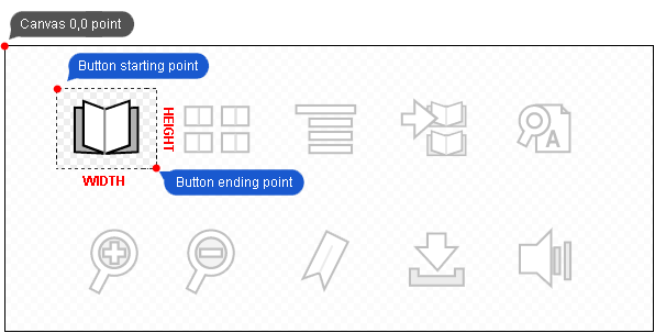
Let's have a look at:
upState="lib#30,30,60,50"lib refers to our media file previously loaded by means of a media element.
- x = 30
- y = 30
- w = 60
- h = 50
Styles
The Calaméo Skin Markup Language (CSML) allows you to completely change the look and feel of all the viewer features using Calaméo Skin Styles (CSS). For example, you can modify the appearance of external links, customize the related publications pop-up and use your own cursor icon.
Make sure to check the "Common attributes" for the features you wish to change.
How to add a Calaméo Skin Stylesheet to your publication
There are currently 2 ways to add Calaméo Skin Styles (CSS) to your publications:
- via an URL parameter
- via a skin
Using an URL parameter
You can specify a styleurl parameter in the HTML embed code that links to your Calaméo Skin Stylesheet (using an absolute URL).
Example:
<iframe src="//v.calameo.com/?bkcode=0000000018a530f2597ee&styleurl=https://mydomain.com/calameo/styles.txt"></iframe>
Don't forget to place a crossdomain.xml file with the correct permissions at the root level of the domain used in your CSS URL.
Using a Calaméo skin
To include a Calaméo Skin Stylesheet in your Calaméo Skin, simply use the tag styles.
You can either place your styles in a CDATA inside the content of the tag like this:
<styles>
common.text.color=0xFF0000
common.text.size=14
</styles>
Or use an external Calaméo Skin Stylesheet specified in a source attribute like this:
<styles source="https://mydomain.com/calameo/styles.txt"></styles>
You can also combine both techniques like this:
<styles source="https://mydomain.com/calameo/styles.txt">
common.text.color=0xFF0000
common.text.size=14
</styles>
Don't forget to place a crossdomain.xml file with the correct permissions at the root level of the domain used in your CSS URL.
Basics
These styles define foundations for look and feel of the viewer.
Texts
All the texts in the viewer inherit from this formatting.
| Attribute | Type | Default | Description |
|---|---|---|---|
| common.text.font | _sans | Font name | |
| common.text.size | 12 | Font size | |
| common.text.color | 0x000000 | Font color | |
| common.text.bold | Bold | ||
| common.text.italic | Italic |
Context
These styles define context management configuration for the viewer.
Margins
| Attribute | Type | Default | Description |
|---|---|---|---|
| common.context.margin.popup | 8 | Margin for popups and other UI elements | |
| common.context.margin.tooltip | 8 | Margin for the tooltips | |
| common.context.margin.zoom | 0 | Margin for the zoom mode |
Minimum screen size to automatically switch to mini mode when no mode is defined
| Attribute | Type | Default | Description |
|---|---|---|---|
| common.context.mini.width | 300 | Minimum width | |
| common.context.mini.height | 240 | Minimum height |
Resize
| Attribute | Type | Default | Description |
|---|---|---|---|
| common.context.resize.delay | 200 | Delay before resizing the viewer context |
Zoom
| Attribute | Type | Default | Description |
|---|---|---|---|
| common.context.zoom.max | 450 | Maximum percent value |
Context
These styles define context management configuration for the viewer.
Margins
| Attribute | Type | Default | Description |
|---|---|---|---|
| context.margin.popup | 5 | Margin for popups and other UI elements | |
| context.margin.zoom | 0 | Margin for the zoom mode |
Resize
| Attribute | Type | Default | Description |
|---|---|---|---|
| context.resize.delay | 200 | Delay before resizing the viewer context |
Views
These styles define the look and feel of thumbnail, scroll and publication views in the viewer.
Thumbnails view
These styles define the look and feel of the thumbnails view.
| Attribute | Type | Default | Description |
|---|---|---|---|
| views.thumbnails.maxscreens | 5 | Maximum number of thumbnail rows displayed | |
| views.thumbnails.width | 80 | Width of thumbnail in pixels. (Height will be calculated according to publication aspect ratio) | |
| views.thumbnails.hmargin | 16 | Horizontal padding in pixels | |
| views.thumbnails.vmargin | 8 | Vertical padding in pixels |
Thumbnail page numbers
| Attribute | Type | Default | Description |
|---|---|---|---|
| views.thumbnails.text.font | _sans | Font name | |
| views.thumbnails.text.size | 12 | Font size | |
| views.thumbnails.text.color | 0x000000 | Font color | |
| views.thumbnails.text.bold | Bold | ||
| views.thumbnails.text.italic | Italic |
Thumbnail drop shadow
| Attribute | Type | Default | Description |
|---|---|---|---|
| views.thumbnails.shadow.color | 0x000000 | Thumbnail drop shadow color | |
| views.thumbnails.shadow.size | 8 | Thumbnail drop shadow size in pixels | |
| views.thumbnails.shadow.angle | 45 | Thumbnail drop shadow angle in degrees starting from the right and going clockwise | |
| views.thumbnails.shadow.alpha | 0.5 | Thumbnail drop shadow transparency. Between 0 and 1 |
Thumbnail highlighter
| Attribute | Type | Default | Description |
|---|---|---|---|
| views.thumbnails.hiliter.color | 0x4BA9E0 | Color of mouse-over thumbnail border highlight | |
| views.thumbnails.hiliter.selectcolor | 0x82C12B | Color of selected thumbnail border highlight | |
| views.thumbnails.hiliter.size | 4 | Thickness of thumbnail border highlight in pixels |
Thumbnail buttons
| Attribute | Type | Default | Description |
|---|---|---|---|
| views.thumbnails.button.left.up | _#gfxIndexButtonBackgroundLeft | Up state of Left thumbnail page navigation button | |
| views.thumbnails.button.left.over | _#gfxIndexButtonBackgroundLeftHover | Over state of Left thumbnail page navigation button | |
| views.thumbnails.button.left.down | _#gfxIndexButtonBackgroundLeftDown | Down state of Left thumbnail page navigation button | |
| views.thumbnails.button.right.up | _#gfxIndexButtonBackgroundRight | Up state of Right thumbnail page navigation button | |
| views.thumbnails.button.right.over | _#gfxIndexButtonBackgroundRightHover | Over state of Right thumbnail page navigation button | |
| views.thumbnails.button.right.down | _#gfxIndexButtonBackgroundRightDown | Down state of Right thumbnail page navigation button |
Scroll view
These styles define the look and feel of the scroll view.
Drop shadow
| Attribute | Type | Default | Description |
|---|---|---|---|
| views.scroll.page.shadow.color | 0x000000 | Shadow color | |
| views.scroll.page.shadow.size | 8 | Shadow size in pixels | |
| views.scroll.page.shadow.angle | 45 | Shadow angle in degrees starting from the right and going clockwise | |
| views.scroll.page.shadow.alpha | 0.5 | Shadow transparency. Between 0 and 1 |
Publication view
These styles define the publication (pageflip) view look and feel.
| Attribute | Type | Default | Description |
|---|---|---|---|
| views.book.flipshadows.alpha | 1.0 | Shadows transparency displayed when a page is flipping. Between 0 and 1 | |
| views.book.centerfold.alpha | 0.5 | Centerfold shadow transparency. Between 0 and 1 | |
| views.book.zoomed.centerfold.alpha | 0.0 | Centerfold shadow transparency when zoomed. Between 0 and 1 |
Pages
This parameter defines an icon to show when a page display error occurs.
| Attribute | Type | Default | Description |
|---|---|---|---|
| views.page.error.icon | _#gfxIconError | Resource from a loaded library |
Tooltips
These styles define the look and feel of all contextual tooltips in the viewer.
Common styles
All the tooltips inherit from these styles.
| Attribute | Type | Default | Description |
|---|---|---|---|
| tooltips.common.verticalmargin | 4 | Vertical padding | |
| tooltips.common.horizontalmargin | 4 | Horizontal padding | |
| tooltips.common.maxwidth | 150 | Maximum width for a tooltip in pixels | |
| tooltips.common.tipsize | 8 | Size of the tip (0 = no tip) | |
| tooltips.common.delay | 0.5 | Delay before displaying the tooltip |
Background
| Attribute | Type | Default | Description |
|---|---|---|---|
| tooltips.common.background.color | 0x000000 | Background color | |
| tooltips.common.background.alpha | 0.9 | Background transparency. Between 0 and 1 |
Border
| Attribute | Type | Default | Description |
|---|---|---|---|
| tooltips.common.border.color | 0x000000 | Border color | |
| tooltips.common.border.size | 0 | Border thickness | |
| tooltips.common.border.alpha | 1 | Border transparency. Between 0 and 1 |
Drop shadow
| Attribute | Type | Default | Description |
|---|---|---|---|
| tooltips.common.shadow.color | 0x000000 | Shadow color | |
| tooltips.common.shadow.size | 8 | Shadow size in pixels | |
| tooltips.common.shadow.angle | 45 | Shadow angle in degrees starting from the right and going clockwise | |
| tooltips.common.shadow.alpha | 0.5 | Shadow transparency. Between 0 and 1 |
Label
Formats the tooltip label.
Inherit from common.text
| Attribute | Type | Default | Description |
|---|---|---|---|
| tooltips.common.text.font | Font name | ||
| tooltips.common.text.size | 11 | Font size | |
| tooltips.common.text.color | 0xFFFFFF | Font color | |
| tooltips.common.text.bold | Bold | ||
| tooltips.common.text.italic | Italic |
Transition
Use these styles to configure the tooltip transitions.
Showing the tooltip
| Attribute | Type | Default | Description |
|---|---|---|---|
| tooltips.common.transition.show.duration | 0.5 | Duration of the transition in seconds (0 = no transition) |
Moving the tooltip
| Attribute | Type | Default | Description |
|---|---|---|---|
| tooltips.common.transition.move.duration | 0 | Duration of the transition in seconds (0 = no transition) |
Actions
Action tooltips are shown when the user place the cursor over a button.
Inherit from tooltips.common
| Attribute | Type | Default | Description |
|---|---|---|---|
| tooltips.action.verticalmargin | 5 | Vertical padding | |
| tooltips.action.horizontalmargin | 5 | Horizontal padding | |
| tooltips.action.maxwidth | 150 | Maximum width for a tooltip in pixels | |
| tooltips.action.tipsize | 8 | Size of the tip (0 = no tip) |
Background
Inherit from tooltips.common.background
| Attribute | Type | Default | Description |
|---|---|---|---|
| tooltips.action.background.color | Background color | ||
| tooltips.action.background.alpha | Background transparency. Between 0 and 1 |
Border
Inherit from tooltips.common.border
| Attribute | Type | Default | Description |
|---|---|---|---|
| tooltips.action.border.color | Border color | ||
| tooltips.action.border.size | Border thickness | ||
| tooltips.action.border.alpha | Border transparency. Between 0 and 1 |
Drop shadow
Inherit from tooltips.common.shadow
| Attribute | Type | Default | Description |
|---|---|---|---|
| tooltips.action.shadow.color | 0x000000 | Shadow color | |
| tooltips.action.shadow.size | 4 | Shadow size in pixels | |
| tooltips.action.shadow.angle | Shadow angle in degrees starting from the right and going clockwise | ||
| tooltips.action.shadow.alpha | 0.3 | Shadow transparency. Between 0 and 1 |
Label
Formats the label.
Inherit from tooltips.common.text
| Attribute | Type | Default | Description |
|---|---|---|---|
| tooltips.action.text.font | Font name | ||
| tooltips.action.text.size | 11 | Font size | |
| tooltips.action.text.color | 0xCCCCCC | Font color | |
| tooltips.action.text.bold | Bold | ||
| tooltips.action.text.italic | Italic |
Page previews
Page preview tooltips are shown when the user places the cursor over an internal link or a button that triggers an page action (see Button actions).
Inherit from tooltips.common
| Attribute | Type | Default | Description |
|---|---|---|---|
| tooltips.page.verticalmargin | 8 | Vertical padding | |
| tooltips.page.horizontalmargin | 8 | Horizontal padding | |
| tooltips.page.maxwidth | 150 | Maximum width for a tooltip in pixels | |
| tooltips.page.tipsize | 8 | Size of the tip (0 = no tip) |
Background
Inherit from tooltips.common.background
| Attribute | Type | Default | Description |
|---|---|---|---|
| tooltips.page.background.color | Background color | ||
| tooltips.page.background.alpha | 0.7 | Background transparency. Between 0 and 1 |
Border
Inherit from tooltips.common.border
| Attribute | Type | Default | Description |
|---|---|---|---|
| tooltips.page.border.color | Border color | ||
| tooltips.page.border.size | Border thickness | ||
| tooltips.page.border.alpha | Border transparency. Between 0 and 1 |
Drop shadow
Inherit from tooltips.common.shadow
| Attribute | Type | Default | Description |
|---|---|---|---|
| tooltips.page.shadow.color | 0x000000 | Shadow color | |
| tooltips.page.shadow.size | 8 | Shadow size in pixels | |
| tooltips.page.shadow.angle | Shadow angle in degrees starting from the right and going clockwise | ||
| tooltips.page.shadow.alpha | Shadow transparency. Between 0 and 1 |
Thumbnail
Formats the page preview thumbnails.
| Attribute | Type | Default | Description |
|---|---|---|---|
| tooltips.page.thumbnail.size | 75 | Thumbnail width in pixels. The height of the thumbnail will be calculated according to the publication aspect ratio |
Links
Links tooltips are shown when the user places the cursor over an external link or a button that triggers a URL action (see Button actions).
Inherit from tooltips.common
| Attribute | Type | Default | Description |
|---|---|---|---|
| tooltips.link.verticalmargin | 5 | Vertical margin | |
| tooltips.link.horizontalmargin | 5 | Horizontal margin | |
| tooltips.link.maxwidth | 150 | Maximum width for a tooltip in pixels | |
| tooltips.link.tipsize | 8 | Size of the tip (0 = no tip) |
Background //
Inherit from tooltips.common.background
| Attribute | Type | Default | Description |
|---|---|---|---|
| tooltips.link.background.color | Background color | ||
| tooltips.link.background.alpha | Background transparency. Between 0 and 1 |
Border
Inherit from tooltips.common.border
| Attribute | Type | Default | Description |
|---|---|---|---|
| tooltips.link.border.color | Border color | ||
| tooltips.link.border.size | Border thickness | ||
| tooltips.link.border.alpha | Border transparency. Between 0 and 1 |
Drop shadow
Inherit from tooltips.common.shadow
| Attribute | Type | Default | Description |
|---|---|---|---|
| tooltips.link.shadow.color | 0x000000 | Shadow color | |
| tooltips.link.shadow.size | Shadow size in pixels | ||
| tooltips.link.shadow.angle | Shadow angle in degrees starting from the right and going clockwise | ||
| tooltips.link.shadow.alpha | Shadow transparency. Between 0 and 1 |
Label
Formats the external link label.
Inherit from tooltips.common.text
| Attribute | Type | Default | Description |
|---|---|---|---|
| tooltips.link.text.font | Font name | ||
| tooltips.link.text.size | 12 | Font size | |
| tooltips.link.text.color | 0xCCCCCC | Font color | |
| tooltips.link.text.bold | true | Bold | |
| tooltips.link.text.italic | Italic |
URL
Formats the external link URL.
Inherit from tooltips.common.text
| Attribute | Type | Default | Description |
|---|---|---|---|
| tooltips.link.url.font | Font name | ||
| tooltips.link.url.size | 11 | Font size | |
| tooltips.link.url.color | 0x666666 | Font color | |
| tooltips.link.url.bold | Bold | ||
| tooltips.link.url.italic | Italic |
Fields
These styles apply to all the viewer input fields such as pageNumbers or the search query field.
| Attribute | Type | Default | Description |
|---|---|---|---|
| fields.margin | 4 | Internal padding |
Text format
Inherit from common.text
| Attribute | Type | Default | Description |
|---|---|---|---|
| fields.text.font | Font name | ||
| fields.text.size | Font size | ||
| fields.text.color | Font color | ||
| fields.text.bold | Bold | ||
| fields.text.italic | Italic |
Border
| Attribute | Type | Default | Description |
|---|---|---|---|
| fields.border.color | Border color | ||
| fields.border.size | Border thickness | ||
| fields.border.alpha | Border transparency. Between 0 and 1 | ||
| fields.border.radius | Corner radius in pixels. |
Background
| Attribute | Type | Default | Description |
|---|---|---|---|
| fields.background.color | Background color | ||
| fields.background.alpha | Background transparency. Between 0 and 1 |
Disabled format
Inherit from common.text
| Attribute | Type | Default | Description |
|---|---|---|---|
| fields.disabled.font | Font name | ||
| fields.disabled.size | Font size | ||
| fields.disabled.color | 0x555555 | Font color | |
| fields.disabled.bold | Bold | ||
| fields.disabled.italic | Italic |
Placeholder format
Inherit from common.text
| Attribute | Type | Default | Description |
|---|---|---|---|
| fields.placeholder.font | Font name | ||
| fields.placeholder.size | Font size | ||
| fields.placeholder.color | 0x999999 | Font color | |
| fields.placeholder.bold | Bold | ||
| fields.placeholder.italic | Italic |
Cursors
Styles that define the cursor's behavior.
| Attribute | Type | Default | Description |
|---|---|---|---|
| cursors.zoomin | _#gfxCursorIconZoomIn | Resource for the "zoom in" cursor | |
| cursors.zoomout | _#gfxCursorIconZoomOut | Resource for the "zoom out" cursor | |
| cursors.zoomdrag | _#gfxCursorHandGrab | Resource for the "hand" cursor | |
| cursors.zoomdragging | _#gfxCursorHandGrabbing | Resource for the "hand dragging" cursor |
Scroller
Defines the mouse drag-and-drop scrolling.
Clicks
| Attribute | Type | Default | Description |
|---|---|---|---|
| scroller.click.distance | 2 | Distance threshold in pixels | |
| scroller.click.duration | 300 | Duration threshold in milliseconds (ms) |
Mousewheel
| Attribute | Type | Default | Description |
|---|---|---|---|
| scroller.mousewheel.speed | 6 | Mouse wheel speed |
Inertia
| Attribute | Type | Default | Description |
|---|---|---|---|
| scroller.inertia.speed | 500 | Inertia speed (higher number = slower) | |
| scroller.inertia.acceleration | 15 | Acceleration of the scroller | |
| scroller.inertia.deceleration | 30 | Deceleration of the scroller | |
| scroller.inertia.friction | 1 | Friction of the scroller |
Bounces
| Attribute | Type | Default | Description |
|---|---|---|---|
| scroller.bounce.duration | 0.3 | Bounce's transition duration in seconds | |
| scroller.bounce.friction | 5 | Bounce's friction |
Sliders
These styles define the look and feel of all scroll bars in the viewer.
Horizontal slider
| Attribute | Type | Default | Description |
|---|---|---|---|
| sliders.horizontal.background | _#gfxScrollbarBackgroundH | Slider background |
Button
| Attribute | Type | Default | Description |
|---|---|---|---|
| sliders.horizontal.button.up | _#gfxScrollbarSliderHOff | Button Up state | |
| sliders.horizontal.button.over | _#gfxScrollbarSliderHHover | Button Over state | |
| sliders.horizontal.button.down | _#gfxScrollbarSliderHDown | Button Down state | |
| sliders.horizontal.button.disabled | _#gfxScrollbarSliderHDisabled | Button Disabled state |
Vertical slider
| Attribute | Type | Default | Description |
|---|---|---|---|
| sliders.vertical.background | _#gfxScrollbarBackgroundV | Slider background |
Button
| Attribute | Type | Default | Description |
|---|---|---|---|
| sliders.vertical.button.up | _#gfxScrollbarSliderVOff | Button Up state | |
| sliders.vertical.button.over | _#gfxScrollbarSliderVHover | Button Over state | |
| sliders.vertical.button.down | _#gfxScrollbarSliderVDown | Button Down state | |
| sliders.vertical.button.disabled | _#gfxScrollbarSliderVDisabled | Button Disabled state |
Loading slider for pages
| Attribute | Type | Default | Description |
|---|---|---|---|
| sliders.loading.background | _#gfxLoadingBackgroundH | Slider background | |
| sliders.loading.level | _#gfxLoadingPlayedH | Slider level |
Links
These styles define the look and feel of all links in the publication, including external links, internal links, video and audio links.
Common links styles
All links inherit from these styles
Flash when the link is activated
| Attribute | Type | Default | Description |
|---|---|---|---|
| links.common.flash.transition.duration | 2.5 | Duration of the flash when links are activated (0 = none) |
Up states
Background
| Attribute | Type | Default | Description |
|---|---|---|---|
| links.common.up.background.color | 0x82C0FF | Background color | |
| links.common.up.background.alpha | 0 | Background transparency. Between 0 and 1 |
Border
| Attribute | Type | Default | Description |
|---|---|---|---|
| links.common.up.border.color | 0x82C0FF | Border color | |
| links.common.up.border.size | 2 | Border thickness | |
| links.common.up.border.alpha | 0 | Border transparency. Between 0 and 1 |
Over state
Background
| Attribute | Type | Default | Description |
|---|---|---|---|
| links.common.over.background.color | 0x82C0FF | Background color | |
| links.common.over.background.alpha | 0.2 | Background transparency. Between 0 and 1 |
Border
| Attribute | Type | Default | Description |
|---|---|---|---|
| links.common.over.border.color | 0x82C0FF | Border color | |
| links.common.over.border.size | 2 | Border thickness | |
| links.common.over.border.alpha | 1 | Border transparency. Between 0 and 1 |
Down state
Background
| Attribute | Type | Default | Description |
|---|---|---|---|
| links.common.down.background.color | 0x93FA87 | Background color | |
| links.common.down.background.alpha | 0.3 | Background transparency. Between 0 and 1 |
Border
| Attribute | Type | Default | Description |
|---|---|---|---|
| links.common.down.border.color | 0x93FA87 | Border color | |
| links.common.down.border.size | 2 | Border thickness | |
| links.common.down.border.alpha | 1 | Border transparency. Between 0 and 1 |
External links
Up state
Inherit from links.common.up
Background
| Attribute | Type | Default | Description |
|---|---|---|---|
| links.extern.up.background.color | Background color | ||
| links.extern.up.background.alpha | Background transparency. Between 0 and 1 |
Border
| Attribute | Type | Default | Description |
|---|---|---|---|
| links.extern.up.border.color | Border color | ||
| links.extern.up.border.size | Border thickness | ||
| links.extern.up.border.alpha | Border transparency. Between 0 and 1 |
Over state
Inherit from links.common.over
Background
| Attribute | Type | Default | Description |
|---|---|---|---|
| links.extern.over.background.color | Background color | ||
| links.extern.over.background.alpha | Background transparency. Between 0 and 1 |
Border
| Attribute | Type | Default | Description |
|---|---|---|---|
| links.extern.over.border.color | Border color | ||
| links.extern.over.border.size | Border thickness | ||
| links.extern.over.border.alpha | Border transparency. Between 0 and 1 |
Down state
Inherit from links.common.down
Background
| Attribute | Type | Default | Description |
|---|---|---|---|
| links.extern.down.background.color | Background color | ||
| links.extern.down.background.alpha | Background transparency. Between 0 and 1 |
Border
| Attribute | Type | Default | Description |
|---|---|---|---|
| links.extern.down.border.color | Border color | ||
| links.extern.down.border.size | Border thickness | ||
| links.extern.down.border.alpha | Border transparency. Between 0 and 1 |
Internal links
Up state
Inherit from links.common.up
Background
| Attribute | Type | Default | Description |
|---|---|---|---|
| links.intern.up.background.color | Background color | ||
| links.intern.up.background.alpha | Background transparency. Between 0 and 1 |
Border
| Attribute | Type | Default | Description |
|---|---|---|---|
| links.intern.up.border.color | Border color | ||
| links.intern.up.border.size | Border thickness | ||
| links.intern.up.border.alpha | Border transparency. Between 0 and 1 |
Over state
Inherit from links.common.over
Background
| Attribute | Type | Default | Description |
|---|---|---|---|
| links.intern.over.background.color | Background color | ||
| links.intern.over.background.alpha | Background transparency. Between 0 and 1 |
Border
| Attribute | Type | Default | Description |
|---|---|---|---|
| links.intern.over.border.color | Border color | ||
| links.intern.over.border.size | Border thickness | ||
| links.intern.over.border.alpha | Border transparency. Between 0 and 1 |
Down state
Inherit from links.common.down
Background
| Attribute | Type | Default | Description |
|---|---|---|---|
| links.intern.down.background.color | Background color | ||
| links.intern.down.background.alpha | Background transparency. Between 0 and 1 |
Border
| Attribute | Type | Default | Description |
|---|---|---|---|
| links.intern.down.border.color | Border color | ||
| links.intern.down.border.size | Border thickness | ||
| links.intern.down.border.alpha | Border transparency. Between 0 and 1 |
Focus links (Zoom Zone)
Focus opening
| Attribute | Type | Default | Description |
|---|---|---|---|
| links.focus.open.trigger | click | Event that triggers the focus opening. Either click or over | |
| links.focus.open.speed | 0.5 | Zoom in speed in seconds (0 = no transition) |
Focus closing
| Attribute | Type | Default | Description |
|---|---|---|---|
| links.focus.close.trigger | over | Event the triggers the focus closing. Either click or over | |
| links.focus.close.speed | 0.3 | Zoom out speed in seconds (0 = no transition) |
Focus background
| Attribute | Type | Default | Description |
|---|---|---|---|
| links.focus.background.color | 0x000000 | Background color | |
| links.focus.background.alpha | 0.5 | Background transparency. Between 0 and 1 |
Up state
Inherit from links.common.up
Background
| Attribute | Type | Default | Description |
|---|---|---|---|
| links.focus.up.background.color | Background color | ||
| links.focus.up.background.alpha | Background transparency. Between 0 and 1 |
Border
| Attribute | Type | Default | Description |
|---|---|---|---|
| links.focus.up.border.color | Border color | ||
| links.focus.up.border.size | Border thickness | ||
| links.focus.up.border.alpha | Border transparency. Between 0 and 1 |
Over state
Inherit from links.common.over
Background
| Attribute | Type | Default | Description |
|---|---|---|---|
| links.focus.over.background.color | Background color | ||
| links.focus.over.background.alpha | Background transparency. Between 0 and 1 |
Border
| Attribute | Type | Default | Description |
|---|---|---|---|
| links.focus.over.border.color | Border color | ||
| links.focus.over.border.size | Border thickness | ||
| links.focus.over.border.alpha | Border transparency. Between 0 and 1 |
Down state
Inherit from links.common.down
Background
| Attribute | Type | Default | Description |
|---|---|---|---|
| links.focus.down.background.color | Background color | ||
| links.focus.down.background.alpha | Background transparency. Between 0 and 1 |
Border
| Attribute | Type | Default | Description |
|---|---|---|---|
| links.focus.down.border.color | Border color | ||
| links.focus.down.border.size | Border thickness | ||
| links.focus.down.border.alpha | Border transparency. Between 0 and 1 |
Publication overlay
| Attribute | Type | Default | Description |
|---|---|---|---|
| links.focus.overlay.color | 0x000000 | Overlay color | |
| links.focus.overlay.alpha | 0.5 | Overlay transparency. Betnween 0 and 1 | |
| links.focus.overlay.blur | true | Blur the publication. Either true or false |
Drop shadow
| Attribute | Type | Default | Description |
|---|---|---|---|
| links.focus.shadow.color | 0x000000 | Shadow color | |
| links.focus.shadow.size | 8 | Shadow size in pixels | |
| links.focus.shadow.angle | 45 | Shadow angle in degrees starting from the right and going clockwise | |
| links.focus.shadow.alpha | 0.5 | Shadow transparency. Between 0 and 1 |
Media link
| Attribute | Type | Default | Description |
|---|---|---|---|
| links.media.loading | _#gfxLoadingAnimation | Resource displayed while loading the media |
Audio link
Off state
| Attribute | Type | Default | Description |
|---|---|---|---|
| links.audio.button.up | _#gfxButtonAudioPlayOff | Up state | |
| links.audio.button.over | _#gfxButtonAudioPlayHover | Over state | |
| links.audio.button.down | _#gfxButtonAudioPlayDown | Down state | |
| links.audio.button.disabled | _#gfxButtonAudioPlayDisabled | Disabled state. Used when an audio link is playing |
Video links
| Attribute | Type | Default | Description |
|---|---|---|---|
| links.video.loading | _#gfxLoadingAnimation | Resource displayed while loading the media (thumbnail or video) |
Video thumbnail
| Attribute | Type | Default | Description |
|---|---|---|---|
| links.video.thumbnail.alpha | 1 | Thumbnail transparency. Between 0 and 1 |
Transitions
| Attribute | Type | Default | Description |
|---|---|---|---|
| links.video.thumbnail.transition.show.duration | 0.5 | Transition duration in seconds (0 = no transition) |
Play button
| Attribute | Type | Default | Description |
|---|---|---|---|
| links.video.button.up | _#gfxButtonVideoPlayOff | Up state | |
| links.video.button.over | _#gfxButtonVideoPlayHover | Over state | |
| links.video.button.down | _#gfxButtonVideoPlayDown | Down state | |
| links.video.button.disabled | _#gfxButtonVideoPlayDisabled | Disabled state (not used) |
Up state
Inherit from links.common.up
Background
| Attribute | Type | Default | Description |
|---|---|---|---|
| links.video.up.background.color | Background color | ||
| links.video.up.background.alpha | 0 | Background transparency. Between 0 and 1 |
Border
| Attribute | Type | Default | Description |
|---|---|---|---|
| links.video.up.border.color | Border color | ||
| links.video.up.border.size | 0 | Border thickness | |
| links.video.up.border.alpha | Border transparency. Between 0 and 1 |
Over state
Inherit from links.common.over
Background
| Attribute | Type | Default | Description |
|---|---|---|---|
| links.video.over.background.color | Background color | ||
| links.video.over.background.alpha | 0 | Background transparency. Between 0 and 1 |
Border
| Attribute | Type | Default | Description |
|---|---|---|---|
| links.video.over.border.color | Border color | ||
| links.video.over.border.size | 0 | Border thickness | |
| links.video.over.border.alpha | Border transparency. Between 0 and 1 |
Down state
Inherit from links.common.down
Background
| Attribute | Type | Default | Description |
|---|---|---|---|
| links.video.down.background.color | Background color | ||
| links.video.down.background.alpha | 0 | Background transparency. Between 0 and 1 |
Border
| Attribute | Type | Default | Description |
|---|---|---|---|
| links.video.down.border.color | Border color | ||
| links.video.down.border.size | 0 | Border thickness | |
| links.video.down.border.alpha | Border transparency. Between 0 and 1 |
Shopping links
Play button
| Attribute | Type | Default | Description |
|---|---|---|---|
| links.shopping.button.up | _#gfxButtonShoppingPlayOff | Up state | |
| links.shopping.button.over | _#gfxButtonShoppingPlayHover | Over state | |
| links.shopping.button.down | _#gfxButtonShoppingPlayDown | Down state | |
| links.shopping.button.disabled | _#gfxButtonShoppingPlayDisabled | Disabled state (not used) |
Sounds
Styles that define audio related behaviors.
| Attribute | Type | Default | Description |
|---|---|---|---|
| sounds.fx.flip | _#sfxPageFlip | Pageflip sound FX |
Audio player
These styles define the look and feel of the embedded audio player.
| Attribute | Type | Default | Description |
|---|---|---|---|
| audioplayer.position | bottom,center | Position of the audio player. Either top, middle or bottom (vertical position) and left, center or right (horizontal position) |
Timecode
Inherit from popups.text
| Attribute | Type | Default | Description |
|---|---|---|---|
| audioplayer.label.font | Font name | ||
| audioplayer.label.size | Font size | ||
| audioplayer.label.color | 0xFFFFFF | Font color | |
| audioplayer.label.bold | Bold | ||
| audioplayer.label.italic | Italic |
Buttons
Play
| Attribute | Type | Default | Description |
|---|---|---|---|
| audioplayer.buttons.play.up | _#gfxButtonPlayOff | Button Up state | |
| audioplayer.buttons.play.over | _#gfxButtonPlayHover | Button Over state | |
| audioplayer.buttons.play.down | _#gfxButtonPlayDown | Button Down state | |
| audioplayer.buttons.play.disabled | _#gfxButtonPlayDisabled | Button Disabled state |
Pause
| Attribute | Type | Default | Description |
|---|---|---|---|
| audioplayer.buttons.pause.up | _#gfxButtonPauseOff | Button Up state | |
| audioplayer.buttons.pause.over | _#gfxButtonPauseHover | Button Over state | |
| audioplayer.buttons.pause.down | _#gfxButtonPauseDown | Button Down state | |
| audioplayer.buttons.pause.disabled | _#gfxButtonPauseDisabled | Button Disabled state |
Volume
| Attribute | Type | Default | Description |
|---|---|---|---|
| audioplayer.buttons.volume.up | _#gfxButtonVolumeOff | Button Up state | |
| audioplayer.buttons.volume.over | _#gfxButtonVolumeHover | Button Over state | |
| audioplayer.buttons.volume.down | _#gfxButtonVolumeDown | Button Down state | |
| audioplayer.buttons.volume.disabled | _#gfxButtonVolumeDisabled | Button Disabled state |
Sliders
Playback
| Attribute | Type | Default | Description |
|---|---|---|---|
| audioplayer.sliders.playback.height | 8 | Playback slider height in pixels | |
| audioplayer.sliders.playback.background | _#gfxSliderBackgroundH | Resource from a loaded library | |
| audioplayer.sliders.playback.level | _#gfxSliderPlayedH | Resource from a loaded library displaying the played part | |
| audioplayer.sliders.playback.loaded | _#gfxSliderLoadedH | Resource from a loaded library displaying the loaded part |
Playback slider button
| Attribute | Type | Default | Description |
|---|---|---|---|
| audioplayer.sliders.playback.button.up | _#gfxProgressBarSliderHOff | Button Up state | |
| audioplayer.sliders.playback.button.over | _#gfxProgressBarSliderHHover | Button Over state | |
| audioplayer.sliders.playback.button.down | _#gfxProgressBarSliderHDown | Button Down state | |
| audioplayer.sliders.playback.button.disabled | _#gfxProgressBarSliderHDisabled | Button Disabled state |
Volume
| Attribute | Type | Default | Description |
|---|---|---|---|
| audioplayer.sliders.volume.height | 4 | Playback slider height in pixels | |
| audioplayer.sliders.volume.background | _#gfxSliderBackgroundH | Resource from a loaded library | |
| audioplayer.sliders.volume.level | _#gfxSliderPlayedH | Resource from a loaded library displaying the played part | |
| audioplayer.sliders.volume.loaded | _#gfxSliderLoadedH | Resource from a loaded library displaying the loaded part |
Volume slider button
| Attribute | Type | Default | Description |
|---|---|---|---|
| audioplayer.sliders.volume.button.up | _#gfxVolumeBarSliderHOff | Button Up state | |
| audioplayer.sliders.volume.button.over | _#gfxVolumeBarSliderHHover | Button Over state | |
| audioplayer.sliders.volume.button.down | _#gfxVolumeBarSliderHDown | Button Down state | |
| audioplayer.sliders.volume.button.disabled | _#gfxVolumeBarSliderHDisabled | Button Disabled state |
Video player
These styles define the look and feel of the embedded video player
| Attribute | Type | Default | Description |
|---|---|---|---|
| videoplayer.margin | 4 | Margin used to position all the video player controls | |
| videoplayer.radius | 8 | Corner radius for the video player |
Timecode
Inherit from common.text
| Attribute | Type | Default | Description |
|---|---|---|---|
| videoplayer.label.font | Font name | ||
| videoplayer.label.size | Font size | ||
| videoplayer.label.color | 0xFFFFFF | Font color | |
| videoplayer.label.bold | Bold | ||
| videoplayer.label.italic | Italic |
Background
| Attribute | Type | Default | Description |
|---|---|---|---|
| videoplayer.background.color | 0x000000 | Background color | |
| videoplayer.background.alpha | 0.8 | Background transparency. Between 0 and 1 |
Transitions
Showing the video player controls
| Attribute | Type | Default | Description |
|---|---|---|---|
| videoplayer.transition.show.duration | 0.5 | Transition duration in seconds (0 = no transition) |
Hiding the video player controls
| Attribute | Type | Default | Description |
|---|---|---|---|
| videoplayer.transition.hide.duration | 0.3 | Transition duration in seconds (0 = no transition) |
Fullscreen mode
Background
| Attribute | Type | Default | Description |
|---|---|---|---|
| videoplayer.fullscreen.background.color | 0x000000 | Background color | |
| videoplayer.fullscreen.background.alpha | Background transparency. Between 0 and 1 |
Notification displayed when the video cannot be loaded
| Attribute | Type | Default | Description |
|---|---|---|---|
| videoplayer.error.icon | _gfxIconError |
Background
| Attribute | Type | Default | Description |
|---|---|---|---|
| videoplayer.error.background.color | 0x000000 | Background color | |
| videoplayer.error.background.alpha | 0.75 | Background transparency. Between 0 and 1 |
Message
Inherit from common.text
| Attribute | Type | Default | Description |
|---|---|---|---|
| videoplayer.error.text.font | Font name | ||
| videoplayer.error.text.size | 9 | Font size | |
| videoplayer.error.text.color | 0xCCCCCC | Font color | |
| videoplayer.error.text.bold | Bold | ||
| videoplayer.error.text.italic | Italic |
Buttons
Play
| Attribute | Type | Default | Description |
|---|---|---|---|
| videoplayer.buttons.play.up | _#gfxButtonPlayOff | Button Up state | |
| videoplayer.buttons.play.over | _#gfxButtonPlayHover | Button Over state | |
| videoplayer.buttons.play.down | _#gfxButtonPlayDown | Button Down state | |
| videoplayer.buttons.play.disabled | _#gfxButtonPlayDisabled | Button Disabled state |
Pause
| Attribute | Type | Default | Description |
|---|---|---|---|
| videoplayer.buttons.pause.up | _#gfxButtonPauseOff | Button Up state | |
| videoplayer.buttons.pause.over | _#gfxButtonPauseHover | Button Over state | |
| videoplayer.buttons.pause.down | _#gfxButtonPauseDown | Button Down state | |
| videoplayer.buttons.pause.disabled | _#gfxButtonPauseDisabled | Button Disabled state |
Volume
| Attribute | Type | Default | Description |
|---|---|---|---|
| videoplayer.buttons.volume.up | _#gfxButtonVolumeOff | Button Up state | |
| videoplayer.buttons.volume.over | _#gfxButtonVolumeHover | Button Over state | |
| videoplayer.buttons.volume.down | _#gfxButtonVolumeDown | Button Down state | |
| videoplayer.buttons.volume.disabled | _#gfxButtonVolumeDisabled | Button Disabled state |
Fullscreen
| Attribute | Type | Default | Description |
|---|---|---|---|
| videoplayer.buttons.fullscreen.up | _#gfxButtonFullscreenOff | Button Up state | |
| videoplayer.buttons.fullscreen.over | _#gfxButtonFullscreenHover | Button Over state | |
| videoplayer.buttons.fullscreen.down | _#gfxButtonFullscreenDown | Button Down state | |
| videoplayer.buttons.fullscreen.disabled | _#gfxButtonFullscreenDisabled | Button Disabled state |
Exit fullscreen
| Attribute | Type | Default | Description |
|---|---|---|---|
| videoplayer.buttons.exitfullscreen.up | _#gfxButtonExitFullscreenOff | Button Up state | |
| videoplayer.buttons.exitfullscreen.over | _#gfxButtonExitFullscreenHover | Button Over state | |
| videoplayer.buttons.exitfullscreen.down | _#gfxButtonExitFullscreenDown | Button Down state | |
| videoplayer.buttons.exitfullscreen.disabled | _#gfxButtonExitFullscreenDisabled | Button Disabled state |
Sliders
Playback
| Attribute | Type | Default | Description |
|---|---|---|---|
| videoplayer.sliders.playback.height | 8 | Playback slider height in pixels | |
| videoplayer.sliders.playback.background | _#gfxBarBackgroundH | Resource from a loaded library | |
| videoplayer.sliders.playback.level | _#gfxBarPlayedH | Resource from a loaded library displaying the played part | |
| videoplayer.sliders.playback.loaded | _#gfxBarLoadedH | Resource from a loaded library displaying the loaded part |
Playback slider button
| Attribute | Type | Default | Description |
|---|---|---|---|
| videoplayer.sliders.playback.button.up | _#gfxProgressBarSliderHOff | Button Up state | |
| videoplayer.sliders.playback.button.over | _#gfxProgressBarSliderHHover | Button Over state | |
| videoplayer.sliders.playback.button.down | _#gfxProgressBarSliderHDown | Button Down state | |
| videoplayer.sliders.playback.button.disabled | _#gfxProgressBarSliderHDisabled | Button Disabled state |
Volume
| Attribute | Type | Default | Description |
|---|---|---|---|
| videoplayer.sliders.volume.height | 4 | Playback slider height in pixels | |
| videoplayer.sliders.volume.background | _#gfxSliderBackgroundH | Resource from a loaded library | |
| videoplayer.sliders.volume.level | _#gfxSliderPlayedH | Resource from a loaded library displaying the played part | |
| videoplayer.sliders.volume.loaded | _#gfxSliderLoadedH | Resource from a loaded library displaying the loaded part |
Volume slider button
| Attribute | Type | Default | Description |
|---|---|---|---|
| videoplayer.sliders.volume.button.up | _#gfxVolumeBarSliderHOff | Button Up state | |
| videoplayer.sliders.volume.button.over | _#gfxVolumeBarSliderHHover | Button Over state | |
| videoplayer.sliders.volume.button.down | _#gfxVolumeBarSliderHDown | Button Down state | |
| videoplayer.sliders.volume.button.disabled | _#gfxVolumeBarSliderHDisabled | Button Disabled state |
Popups
These styles define the look and feel of popups, including table of contents, related publications and search.
| Attribute | Type | Default | Description |
|---|---|---|---|
| popups.verticalmargin | 8 | Vertical padding | |
| popups.horizontalmargin | 8 | Horizontal padding | |
| popups.spacer | 0 | Space between children in pixels | |
| popups.tipsize | 8 | Tip size in pixels (0 = no tip) |
Lightmode
| Attribute | Type | Default | Description |
|---|---|---|---|
| popups.lightmode.threshold.width | 300 | Lightmode width threshold | |
| popups.lightmode.threshold.height | 300 | Lightmode height threshold |
Popup title format
Formats the popup title.
Inherit from common.text
| Attribute | Type | Default | Description |
|---|---|---|---|
| popups.title.font | Font name | ||
| popups.title.size | 14 | Font size | |
| popups.title.color | 0xFFFFFF | Font color | |
| popups.title.bold | true | Bold | |
| popups.title.italic | Italic |
Content text format
Formats the popup text content.
Inherit from common.text
| Attribute | Type | Default | Description |
|---|---|---|---|
| popups.text.font | Font name | ||
| popups.text.size | Font size | ||
| popups.text.color | 0xFFFFFF | Font color | |
| popups.text.bold | Bold | ||
| popups.text.italic | Italic |
Menu items
| Attribute | Type | Default | Description |
|---|---|---|---|
| popups.items.verticalmargin | 4 | Vertical padding | |
| popups.items.horizontalmargin | 4 | Horizontal padding |
Item icon
| Attribute | Type | Default | Description |
|---|---|---|---|
| popups.items.tooltip.spacer | 8 | Space between the icon and the tooltip | |
| popups.items.tooltip.position | right | Default position of the icon (left, right, top, bottom) |
Up text format
Formats the up state popup text content.
Inherit from popups.text
| Attribute | Type | Default | Description |
|---|---|---|---|
| popups.items.up.font | Font name | ||
| popups.items.up.size | Font size | ||
| popups.items.up.color | 0xEEEEEE | Font color | |
| popups.items.up.bold | Bold | ||
| popups.items.up.italic | Italic |
Over text format
Formats the over state popup text content.
Inherit from popups.text
| Attribute | Type | Default | Description |
|---|---|---|---|
| popups.items.over.font | Font name | ||
| popups.items.over.size | Font size | ||
| popups.items.over.color | 0xFFFFFF | Font color | |
| popups.items.over.bold | Bold | ||
| popups.items.over.italic | Italic |
Down text format
Formats the down state popup text content.
Inherit from popups.text
| Attribute | Type | Default | Description |
|---|---|---|---|
| popups.items.down.font | Font name | ||
| popups.items.down.size | Font size | ||
| popups.items.down.color | 0xAAAAAA | Font color | |
| popups.items.down.bold | Bold | ||
| popups.items.down.italic | Italic |
Disabled text format
Formats the disabled state popup text content.
Inherit from popups.text
| Attribute | Type | Default | Description |
|---|---|---|---|
| popups.items.disabled.font | Font name | ||
| popups.items.disabled.size | Font size | ||
| popups.items.disabled.color | 0x666666 | Font color | |
| popups.items.disabled.bold | Bold | ||
| popups.items.disabled.italic | Italic |
Transitions
Showing the popup
| Attribute | Type | Default | Description |
|---|---|---|---|
| popups.transition.show.duration | 0.5 | Transition duration in seconds (0 = no transition) |
Resizing the popup
| Attribute | Type | Default | Description |
|---|---|---|---|
| popups.transition.resize.duration | 0.5 | Transition duration in seconds (0 = no transition) |
Highlighting
Displayed to highlight the popup content element below the cursor. You can specify a resource from a loaded library. If no resource is specified, a rectangle of the element's size will be displayed.
| Attribute | Type | Default | Description |
|---|---|---|---|
| popups.selected.symbol | null | Resource from a loaded library. The resource will be stretched to fit the element size | |
| popups.selected.color | 0xFFFFFF | Rectangle color | |
| popups.selected.alpha | 0.15 | Rectangle transparency. Between 0 and 1 |
Border
| Attribute | Type | Default | Description |
|---|---|---|---|
| popups.border.color | 0x000000 | Border color | |
| popups.border.size | 0 | Border thickness | |
| popups.border.alpha | Border transparency. Between 0 and 1 |
Background
| Attribute | Type | Default | Description |
|---|---|---|---|
| popups.background.color | 0x000000 | Background color | |
| popups.background.alpha | 0.9 | Background transparency. Between 0 and 1 |
Popup shadow
| Attribute | Type | Default | Description |
|---|---|---|---|
| popups.shadow.color | 0x000000 | Shadow color | |
| popups.shadow.size | 8 | Shadow size in pixels | |
| popups.shadow.angle | 45 | Shadow angle in degrees starting from the right and going clockwise | |
| popups.shadow.alpha | 0.5 | Shadow transparency. Between 0 and 1 |
"No result" snippet
| Attribute | Type | Default | Description |
|---|---|---|---|
| popups.noresult.icon | _#gfxIconInfo | Resource from a loaded library |
Label
Formats the text displayed by the "No result" snippet.
Inherit from popups.text
| Attribute | Type | Default | Description |
|---|---|---|---|
| popups.noresult.label.font | Font name | ||
| popups.noresult.label.size | Font size | ||
| popups.noresult.label.color | 0x999999 | No result color | |
| popups.noresult.label.bold | Bold | ||
| popups.noresult.label.italic | Italic |
"Loading" snippet
| Attribute | Type | Default | Description |
|---|---|---|---|
| popups.loading.icon | _#gfxLoadingAnimation | Resource from a loaded library displayed while loading popup content |
Label
Inherit from popups.text
| Attribute | Type | Default | Description |
|---|---|---|---|
| popups.loading.label.font | Font name | ||
| popups.loading.label.size | Font size | ||
| popups.loading.label.color | 0x999999 | Font color | |
| popups.loading.label.bold | Bold | ||
| popups.loading.label.italic | Italic |
"Load more" snippet
| Attribute | Type | Default | Description |
|---|---|---|---|
| popups.more.icon | _#gfxIconPlus | Resource from a loaded library |
Label
Inherit from popups.text
| Attribute | Type | Default | Description |
|---|---|---|---|
| popups.more.label.font | Font name | ||
| popups.more.label.size | Font size | ||
| popups.more.label.color | 0xFFFFFF | Load more label color | |
| popups.more.label.bold | Bold | ||
| popups.more.label.italic | Italic |
Close button
The popup close button is displayed when the popup is displayed in "light" mode.
| Attribute | Type | Default | Description |
|---|---|---|---|
| popups.close.up | _#gfxButtonCloseInsetOff | Button Up state | |
| popups.close.over | _#gfxButtonCloseInsetHover | Button Over state | |
| popups.close.down | _#gfxButtonCloseInsetDown | Button Down state | |
| popups.close.disabled | _#gfxButtonCloseInsetDisabled | Button Disabled state |
Separator
Line that separates content elements in a popup.
| Attribute | Type | Default | Description |
|---|---|---|---|
| popups.separator.color | 0x333333 | ||
| popups.separator.size | 1 | Thickness | |
| popups.separator.alpha | 1 | Transparency. Between 0 and 1 |
Table of Contents
These styles define the look and feel of the table of contents popup.
| Attribute | Type | Default | Description |
|---|---|---|---|
| toc.width | 500 | Width of the popup in pixels | |
| toc.indent | 16 | Level indentation |
Items
Label text format
Inherit from popups.text
| Attribute | Type | Default | Description |
|---|---|---|---|
| toc.items.label.font | Font name | ||
| toc.items.label.size | Font size | ||
| toc.items.label.color | Font color | ||
| toc.items.label.bold | Bold | ||
| toc.items.label.italic | Italic |
Page number text format
Inherit from popups.text
| Attribute | Type | Default | Description |
|---|---|---|---|
| toc.items.pagenumber.font | Font name | ||
| toc.items.pagenumber.size | 10 | Page number size | |
| toc.items.pagenumber.color | 0x999999 | Page number color | |
| toc.items.pagenumber.bold | Bold | ||
| toc.items.pagenumber.italic | Italic |
Level formats
The table of contents can display up to 6 nested levels of items.
Level 1
Label
Inherit from toc.label
| Attribute | Type | Default | Description |
|---|---|---|---|
| toc.levels.level1.label.font | Font name | ||
| toc.levels.level1.label.size | 18 | Font size | |
| toc.levels.level1.label.color | Font color | ||
| toc.levels.level1.label.bold | true | Bold | |
| toc.levels.level1.label.italic | Italic |
Page number
Inherit from toc.pagenumber
| Attribute | Type | Default | Description |
|---|---|---|---|
| toc.levels.level1.pagenumber.font | Font name | ||
| toc.levels.level1.pagenumber.size | Font size | ||
| toc.levels.level1.pagenumber.color | Font color | ||
| toc.levels.level1.pagenumber.bold | Bold | ||
| toc.levels.level1.pagenumber.italic | Italic |
Level 2
Label
Inherit from toc.label
| Attribute | Type | Default | Description |
|---|---|---|---|
| toc.levels.level2.label.font | Font name | ||
| toc.levels.level2.label.size | 16 | Font size | |
| toc.levels.level2.label.color | Font color | ||
| toc.levels.level2.label.bold | true | Bold | |
| toc.levels.level2.label.italic | Italic |
Page number
Inherit from toc.pagenumber
| Attribute | Type | Default | Description |
|---|---|---|---|
| toc.levels.level2.pagenumber.font | Font name | ||
| toc.levels.level2.pagenumber.size | Font size | ||
| toc.levels.level2.pagenumber.color | Font color | ||
| toc.levels.level2.pagenumber.bold | Bold | ||
| toc.levels.level2.pagenumber.italic | Italic |
Level 3
Label
Inherit from toc.label
| Attribute | Type | Default | Description |
|---|---|---|---|
| toc.levels.level3.label.font | Font name | ||
| toc.levels.level3.label.size | 14 | Font size | |
| toc.levels.level3.label.color | Font color | ||
| toc.levels.level3.label.bold | Bold | ||
| toc.levels.level3.label.italic | Italic |
Page number
Inherit from toc.pagenumber
| Attribute | Type | Default | Description |
|---|---|---|---|
| toc.levels.level3.pagenumber.font | Font name | ||
| toc.levels.level3.pagenumber.size | Font size | ||
| toc.levels.level3.pagenumber.color | Font color | ||
| toc.levels.level3.pagenumber.bold | Bold | ||
| toc.levels.level3.pagenumber.italic | Italic |
Level 4
Label
Inherit from toc.label
| Attribute | Type | Default | Description |
|---|---|---|---|
| toc.levels.level4.label.font | Font name | ||
| toc.levels.level4.label.size | 12 | Font size | |
| toc.levels.level4.label.color | Font color | ||
| toc.levels.level4.label.bold | Bold | ||
| toc.levels.level4.label.italic | Italic |
Page number
Inherit from toc.pagenumber
| Attribute | Type | Default | Description |
|---|---|---|---|
| toc.levels.level4.pagenumber.font | Font name | ||
| toc.levels.level4.pagenumber.size | Font size | ||
| toc.levels.level4.pagenumber.color | Font color | ||
| toc.levels.level4.pagenumber.bold | Bold | ||
| toc.levels.level4.pagenumber.italic | Italic |
Level 5
Label
Inherit from toc.label
| Attribute | Type | Default | Description |
|---|---|---|---|
| toc.levels.level5.label.font | Font name | ||
| toc.levels.level5.label.size | 11 | Font size | |
| toc.levels.level5.label.color | Font color | ||
| toc.levels.level5.label.bold | Bold | ||
| toc.levels.level5.label.italic | Italic |
Page number
Inherit from toc.pagenumber
| Attribute | Type | Default | Description |
|---|---|---|---|
| toc.levels.level5.pagenumber.font | Font name | ||
| toc.levels.level5.pagenumber.size | Font size | ||
| toc.levels.level5.pagenumber.color | Font color | ||
| toc.levels.level5.pagenumber.bold | Bold | ||
| toc.levels.level5.pagenumber.italic | Italic |
Level 6
Label
Inherit from toc.label
| Attribute | Type | Default | Description |
|---|---|---|---|
| toc.levels.level6.label.font | Font name | ||
| toc.levels.level6.label.size | 9 | Font size | |
| toc.levels.level6.label.color | Font color | ||
| toc.levels.level6.label.bold | Bold | ||
| toc.levels.level6.label.italic | Italic |
Page number
Inherit from toc.pagenumber
| Attribute | Type | Default | Description |
|---|---|---|---|
| toc.levels.level6.pagenumber.font | Font name | ||
| toc.levels.level6.pagenumber.size | Font size | ||
| toc.levels.level6.pagenumber.color | Font color | ||
| toc.levels.level6.pagenumber.bold | Bold | ||
| toc.levels.level6.pagenumber.italic | Italic |
Related publications
These styles define the look and feel of the related publications popup.
| Attribute | Type | Default | Description |
|---|---|---|---|
| related.width | 500 | Width of the popup in pixels |
Publication
Thumbnail
Formats the item thumbnails in the related publications popup.
| Attribute | Type | Default | Description |
|---|---|---|---|
| related.items.thumbnail.size | 75 | Thumbnail width in pixels. The height of the thumbnail will be calculated according to the publication aspect ratio |
Title
Inherit from popups.text
| Attribute | Type | Default | Description |
|---|---|---|---|
| related.items.title.font | Font name | ||
| related.items.title.size | Font size | ||
| related.items.title.color | Font color | ||
| related.items.title.bold | true | Bold | |
| related.items.title.italic | Italic |
Description
Inherit from popups.text
| Attribute | Type | Default | Description |
|---|---|---|---|
| related.items.text.font | Font name | ||
| related.items.text.size | Font size | ||
| related.items.text.color | 0x999999 | Font color | |
| related.items.text.bold | Bold | ||
| related.items.text.italic | Italic |
Search
These styles define the look and feel of the search popup
| Attribute | Type | Default | Description |
|---|---|---|---|
| search.width | 500 | Width of the popup in pixels |
Result item
Thumbnail
| Attribute | Type | Default | Description |
|---|---|---|---|
| search.items.thumbnail.size | 75 | Thumbnail width in pixels. The height of the thumbnail will be calculated according to the publication aspect ratio |
Page number
Inherit from popups.text
| Attribute | Type | Default | Description |
|---|---|---|---|
| search.items.title.font | Font name | ||
| search.items.title.size | Font size | ||
| search.items.title.color | Font color | ||
| search.items.title.bold | true | Bold | |
| search.items.title.italic | Italic |
Result snippet
Inherit from popups.text
| Attribute | Type | Default | Description |
|---|---|---|---|
| search.items.text.font | Font name | ||
| search.items.text.size | Font size | ||
| search.items.text.color | 0x999999 | Description color | |
| search.items.text.bold | Bold | ||
| search.items.text.italic | Italic |
Highlighting
| Attribute | Type | Default | Description |
|---|---|---|---|
| search.items.highlight.css | 0xFFFF00 | Cascading Style Sheet (CSS) for highlighting the search query in the result snippet |
Share
These styles define the look and feel of the sharing popup.
Share option icons
| Attribute | Type | Default | Description |
|---|---|---|---|
| share.icons.facebook | _#gfxIconFacebook | Resource from a loaded library displayed while loading popup content | |
| share.icons.twitter | _#gfxIconTwitter | Resource from a loaded library displayed while loading popup content | |
| share.icons.email | _#gfxIconEmail | Resource from a loaded library displayed while loading popup content | |
| share.icons.embed | _#gfxIconEmbed | Resource from a loaded library displayed while loading popup content | |
| share.icons.url | _#gfxIconLink | Resource from a loaded library displayed while loading popup content |
Item label
Inherit from popups.text
| Attribute | Type | Default | Description |
|---|---|---|---|
| share.text.font | Font name | ||
| share.text.size | Font size | ||
| share.text.color | 0xDDDDDD | Font color | |
| share.text.bold | Bold | ||
| share.text.italic | Italic |
Copy notification
When the user copies the publication's HTML embed code, a notification is displayed in the popup.
| Attribute | Type | Default | Description |
|---|---|---|---|
| share.copy.icon | _#gfxIconValid | Resource from a loaded library |
Label
Inherit from popups.text
| Attribute | Type | Default | Description |
|---|---|---|---|
| share.copy.label.font | Font name | ||
| share.copy.label.size | Font size | ||
| share.copy.label.color | 0xA0C179 | Font color | |
| share.copy.label.bold | Bold | ||
| share.copy.label.italic | Italic |
Lightbox
These styles define the look and feel of lightboxes.
| Attribute | Type | Default | Description |
|---|---|---|---|
| lightbox.width | 0.94 | Width of the lightbox as percentage of the viewport width | |
| lightbox.height | 0.94 | Height of the lightbox as percentage of the viewport height | |
| lightbox.verticalmargin | 15 | Minimum vertical margin around the lightbox | |
| lightbox.horizontalmargin | 15 | Minimum horizontal margin around the lightbox | |
| lightbox.verticalpadding | 8 | Vertical padding | |
| lightbox.horizontalpadding | 8 | Horizontal padding |
Transitions
Showing the lightbox
| Attribute | Type | Default | Description |
|---|---|---|---|
| lightbox.transition.show.duration | 0.3 | Transition duration in seconds (0 = no transition) |
Border
| Attribute | Type | Default | Description |
|---|---|---|---|
| lightbox.border.color | 0x000000 | Border color | |
| lightbox.border.size | 0 | Border thickness | |
| lightbox.border.alpha | Border transparency. Between 0 and 1 |
Background
| Attribute | Type | Default | Description |
|---|---|---|---|
| lightbox.background.color | 0x000000 | Background color | |
| lightbox.background.alpha | 0.9 | Background transparency. Between 0 and 1 |
Lightbox shadow
| Attribute | Type | Default | Description |
|---|---|---|---|
| lightbox.shadow.color | 0x000000 | Shadow color | |
| lightbox.shadow.size | 8 | Shadow size in pixels | |
| lightbox.shadow.angle | 45 | Shadow angle in degrees starting from the right and going clockwise | |
| lightbox.shadow.alpha | 0.5 | Shadow transparency. Between 0 and 1 |
Close button
The lightbox close button
| Attribute | Type | Default | Description |
|---|---|---|---|
| lightbox.close.up | _#gfxButtonCloseInsetOff | Button Up state | |
| lightbox.close.over | _#gfxButtonCloseInsetHover | Button Over state | |
| lightbox.close.down | _#gfxButtonCloseInsetDown | Button Down state | |
| lightbox.close.disabled | _#gfxButtonCloseInsetDisabled | Button Disabled state |
Actions
Navigation
| Action | Description |
|---|---|
| left | If the publication reading mode is "LTR" (left-to-right), go to the next page. If the publication direction is "RTL" (right-to-left), go to the previous page. If you are using arrows as navigation icons, it is strongly advised to use left instead of nextPage for "LTR" publication and previousPage for "RTL" publication. |
| right | If the publication reading mode is "LTR" (left-to-right), go to the previous page. If the publication direction is "RTL" (right-to-left), go to the next page. If you are using arrows as navigation icons, it is strongly advised to use right instead of previousPage for "LTR" publication and nextPage for "RTL" publication. |
| fullleft | If the publication reading mode is "LTR" (left-to-right), go to the last page. If the publication direction is "RTL" (right-to-left), go to the first page. If you are using arrows as navigation icons, it is strongly advised to use fullleft instead of lastPage for "LTR" publication and firstPage for "RTL" publication. |
| fullright | If the publication reading mode is "LTR" (left-to-right), go to the first page. If the publication direction is "RTL" (right-to-left), go to the last page. If you are using arrows as navigation icons, it is strongly advised to use fullright instead of firstPage for "LTR" publication and lastPage for "RTL" publication. |
| previousPage | Goes to the previous page |
| nextPage | Goes to the next page |
| firstPage | Goes to the front cover |
| lastPage | Goes to the back cover |
| page#n | Goes to page n |
| url#u|t | Goes to the URL u using target t (either _blank, _top, _self, _overlay) |
| read#b | Goes to the publication b |
Submenus
| Action | Description |
|---|---|
| submenu | Displays a submenu |
View
| Action | Description |
|---|---|
| book | Displays the pageflip view |
| slide | Displays the slide view |
| scroll | Displays the scroll view |
| thumbnails | Displays the publication overview using thumbnails |
Share
| Action | Description |
|---|---|
| share | Displays the share option panel |
| shareOnFacebook | Opens the Facebook sharing page |
| shareOnTwitter | Opens the Twitter sharing page |
| shareOnLinkedIn | Opens the LinkedIn sharing page |
| shareOnPinterest | Opens the Pinterest sharing page |
| shareOnTumblr | Opens the Tumblr sharing page |
| shareByEmail | Opens a new email containing the URL of the publication |
Zoom
| Action | Description |
|---|---|
| zoom | Displays the zoom option panel |
| zoomIn | Increase the zoom level |
| zoomOut | Decrease the zoom level |
| zoomDrag | Switch the zoom drag mode to manual |
| zoomCursor | Switch the zoom drag mode to automatic |
Volume
| Action | Description |
|---|---|
| volume | Displays the volume option panel |
| volumeUp | Increase the volume level |
| volumeDown | Decrease the volume level |
| audioPlay | Enable the background sound and sound fx playback |
| audioPause | Disable the background sound and sound fx playback |
| Action | Description |
|---|---|
| Displays the printing option panel | |
| printPage | Prints the current double page for the book view and the current page for the other views (only available to PREMIUM and PLATINUM accounts) |
| printAll | Prints the entire publication (only available to PLATINUM accounts) |
Misc
| Action | Description |
|---|---|
| toc | Displays the table of contents, when available |
| related | Displays a list of related publications |
| search | Displays the search panel |
| fullscreen | Displays the publication in fullscreen mode |
| download | Downloads the original document |
| mini | Triggers the miniCalameo action |
Behaviors
Behaviors allow you to customize your publication design even further by adding special effects.
Common attributes
| Attribute | Default | Description |
|---|---|---|
| showOnView | book,index,slide,scroll | Specifies in which views the element is displayed. It can be either book, index, slide, scroll or a comma separated list of views (ex: book,slide). |
| showOnMode | normal,fullscreen | Specifies in which modes the element is displayed. It can be either mini, normal, fullscreen or a comma separated list of modes (ex: normal,fullscreen). |
| showOnState | normal,zoom | Specifies in which states the element is displayed. It can be either normal or zoom. |
| showOnPages | first-last | Specifies on which pages the element is displayed. It can be either a page number (ex: 3), a range of pages (ex: 1-9), first for the first page, last for the last page or a comma separated list of pages (ex: 1,7-9,last). |
| showOnDirection | ltr,rtl | Specifies in which direction the element is displayed. It can be either ltr (left to right), rtl. |
| behaviors | A comma separated list of behavior references or group (ex: fade,sound+cursor). Behaviors separated by a comma are triggered one after the other. Behaviors in a group are triggered simultaneously. |
You can group behaviors together so that they will be triggered simultaneously.
To group behaviors, simply use the + symbol.
Example:
<layout behaviors="fade+sound" ></layout>Scope
Custom behaviors
Custom behaviors allow you define the effects added to your publications.
Attributes
| Attribute | Description |
|---|---|
| name | Reference of the custom behavior to use in the behaviors attribute |
| fx | Behavior to use |
Example:
<behavior name="fxhover" fx="hover" tolerance="220" from="20" to="100" on="both" duration="500"/>screen
Show/hide elements according to the viewport width/height
| Attribute | Type | Default | Description |
|---|---|---|---|
| type | show | Define the action to apply. Either show or hide | |
| orientation | horizontal | Define what viewport size to use. Either horizontal or vertical | |
| from | 0 | Minimum viewport size to apply the action | |
| to | 0 | Maximum viewport size to apply the action |
Example:
<behavior name="fx1" fx="screen" type="hide" orientation="horizontal" to="500" />fade
Show and hide the element using a fade transition.
| Attribute | Type | Default | Description |
|---|---|---|---|
| min | 0 | Minimum opacity between 0 and 100 | |
| max | 100 | Maximum opacity between 0 and 100 | |
| duration | 500 | Duration of the transition in milliseconds |
Example:
<behavior name="fx1" fx="fade" min="0" max="100" duration="300" />sound
Play an MP3 sound file.
| Attribute | Type | Default | Description |
|---|---|---|---|
| on | both | Event that triggers the transition. It can be either show, hide or both | |
| url | Absolute URL of the MP3 sound file to play | ||
| volume | 100 | Sound volume between 0 and 100, in percentage of the global volume level |
Example:
<behavior name="fx2" fx="sound" volume="50" url="https://example.com/sound.mp3" />cursor
Change the cursor for a specified graphic resource.
| Attribute | Type | Default | Description |
|---|---|---|---|
| on | mousemove | Event that triggers the cursor change. It can be either mousemove or click | |
| symbol | Name of a graphic resource from a loaded library | ||
| source | Absolute URL of the graphic resource to use | ||
| hidemouse | false | Hide the mouse cursor leaving only the custom cursor. Either true or false |
Example:
<behavior name="fx3" fx="cursor" on="mousemove" url="https://www.example.com/cursor.png" />hover
Show and hide the element when the cursor is over it.
| Attribute | Type | Default | Description |
|---|---|---|---|
| on | both | Action to perform when the cursor is in the area. Either show or hide | |
| duration | 0 | Duration of the appear/fade transition in milliseconds (ms) | |
| from | 0 | Transparency when the cursor is not over the element from 0 to 100 | |
| to | 100 | Transparency when the cursor is over the element from 0 to 100 | |
| tolerance | 0 | Expands the area on each side (in pixels) |
Example:
<behavior name="fx4" fx="hover" />shadow
Add a drop shadow to the element.
| Attribute | Type | Default | Description |
|---|---|---|---|
| color | 0x000000 | Color of the shadow | |
| alpha | 100 | Shadow opacity between 0 and 100 | |
| size | 8 | Size of the shadow | |
| distance | 4 | Distance from the element | |
| angle | 45 | Angle in degrees of the shadow between 0 and 360 | |
| inner | false | Apply the shadow inside the element. Either true or false |
Example:
<behavior name="fx1" fx="shadow" color="0xFF0000" alpha="50" size="6" />


